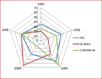
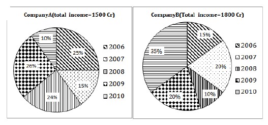
Given below is the radar graph showing the percentage profit of 2 companies from year 2006 to 2010(Ex- The profit % of company A in 2010 is 28%). The pie charts show the percentage distribution of total income of each company in different years. Study the data carefully and answer the following questions.

Correct!
Wrong!
-
Correct!
Wrong!
-
Correct!
Wrong!
-
1)The expenditure of company A is maximum in?
Correct!
Wrong!
-
2) Expenditure of Company A in 2007 is approximately what % of expenditure of company B in 2006?
Correct!
Wrong!
-
3) What is the overall profit percentage of company A, taking the total income and total expenditure of all the years together ? (approximate).
Correct!
Wrong!
-
4) Find the difference in expenditure of both companies in 2010. (round off to 2 decimal places).
Correct!
Wrong!
-
5) If there is 20% increase in profit percent of company B in 2011, but there is 60% decrease in income of 2011 as compared to previous year. Then find the approximate expenditure of company B in 2011.
Correct!
Wrong!
-
Quantitative Aptitude Quiz for IBPS | RRB – Set 272
I got %%score%% of %%total%% right

Also Check Out Quantitative Aptitude Quiz for IBPS | RRB – Set 271
